Design case study
Redesigning the learner flow — one obvious next step
The in-course experience behind learn.mru.org, which I redesigned end to end during MRU's 2026 platform rebuild. Years of mission pivots had left a site that made learners do the navigating; the redesign gives every screen one job — answer "what should I do next?"
- 2.5M learners a year
- 5-month rebuild
- Solo — design and build
- In production
01 The flow, in five steps
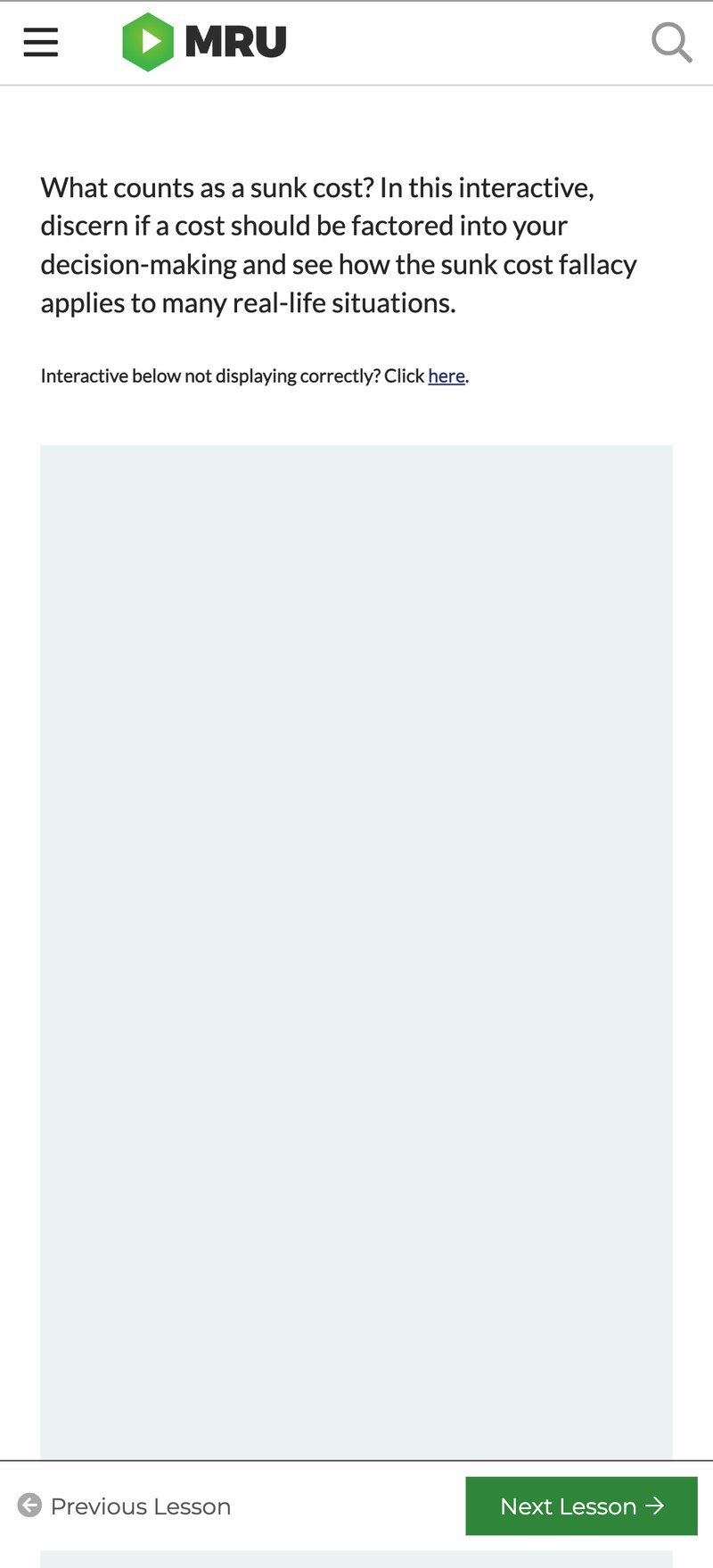
"Before" screens come from the Wayback Machine's archive of the Drupal 7 site — some embedded media didn't archive and shows as empty frames.
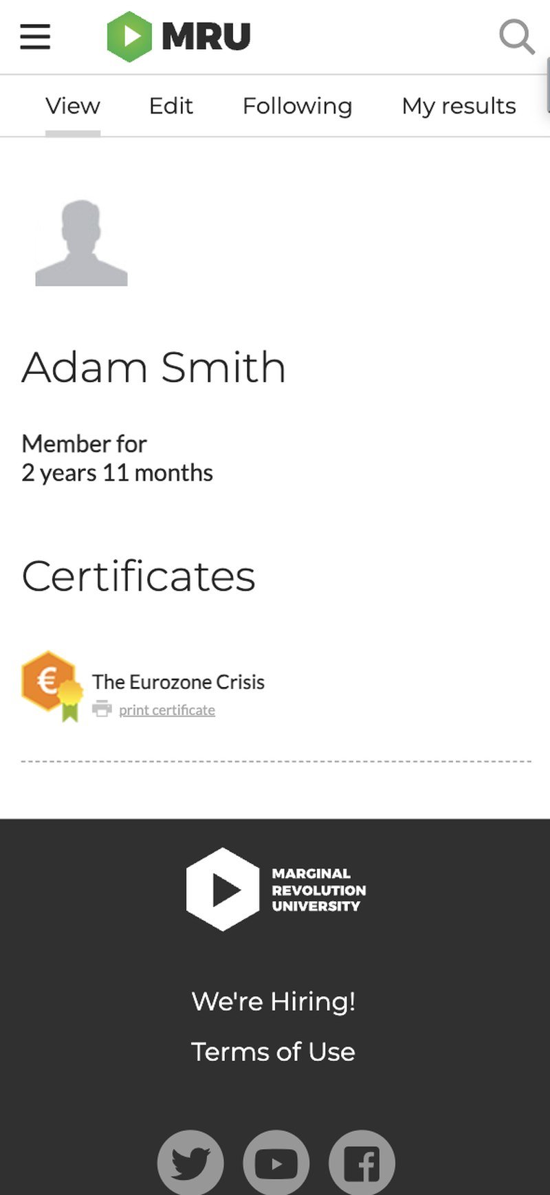
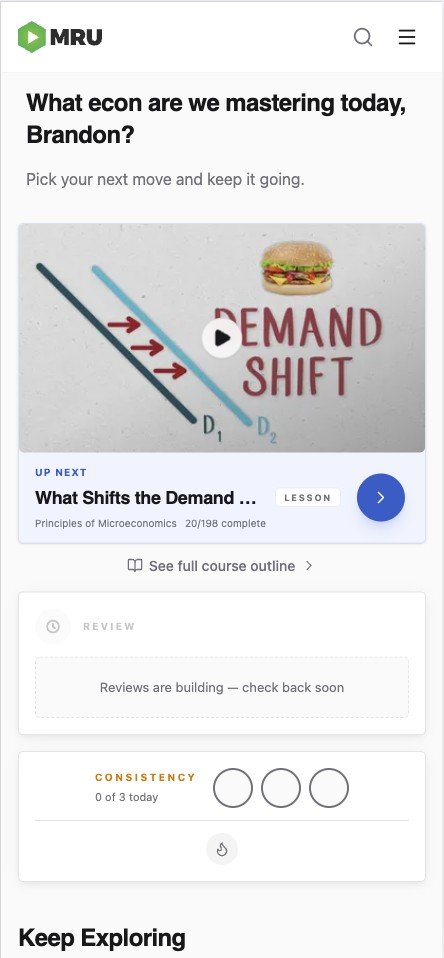
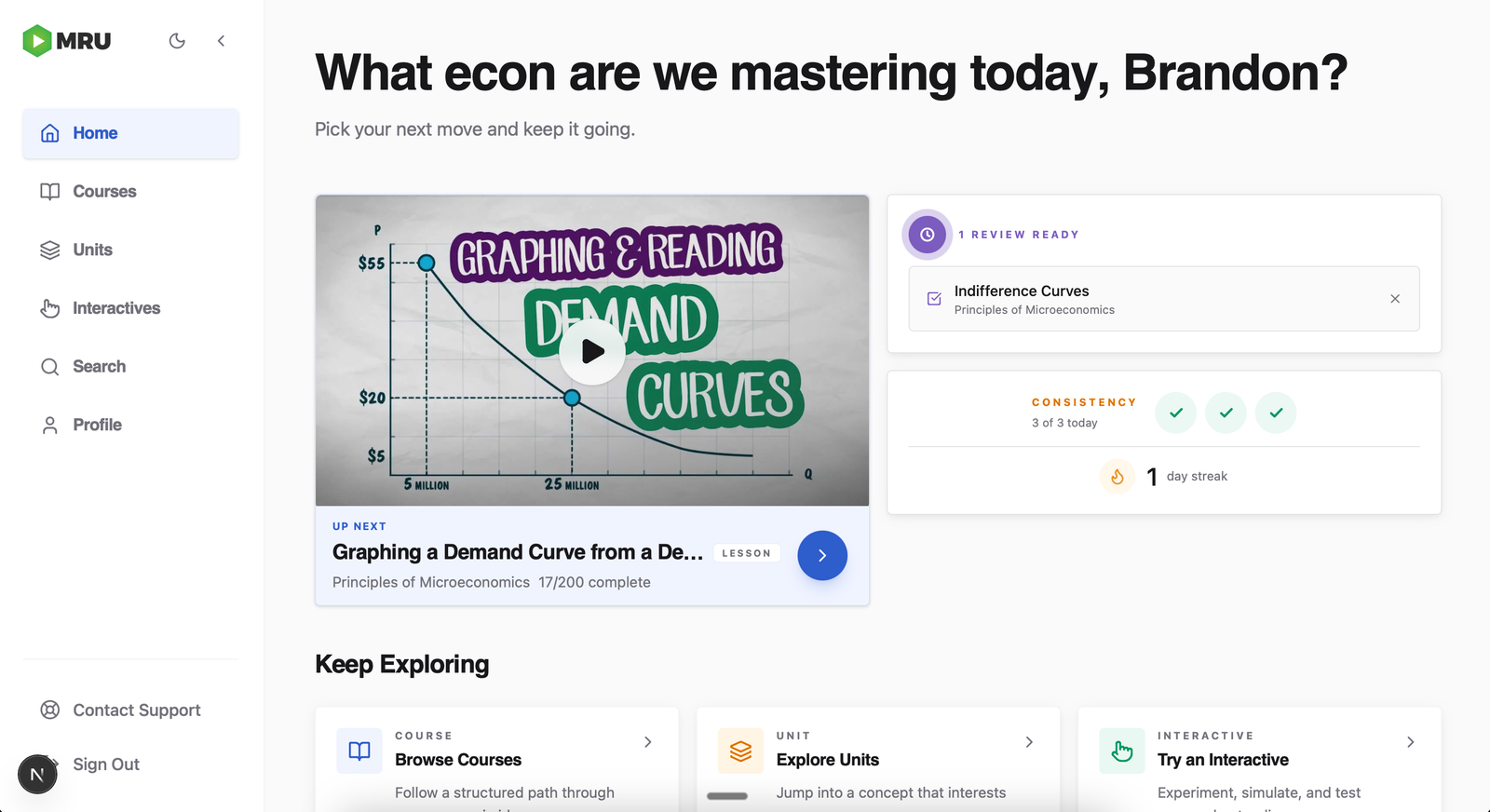
1 · Coming back
The old site's answer to "where was I?" was a profile page. Returning is now one tap.
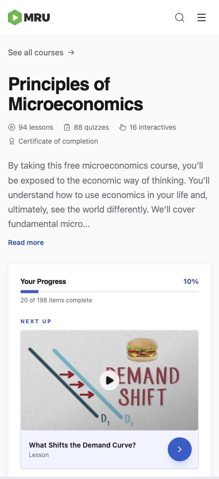
2 · Starting a course
The old course page greeted everyone with the same green "Start Course." The new one knows where you left off.

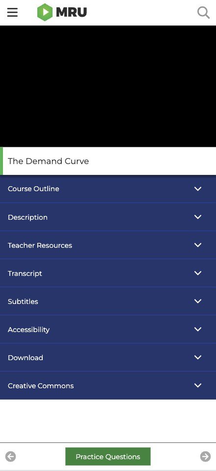
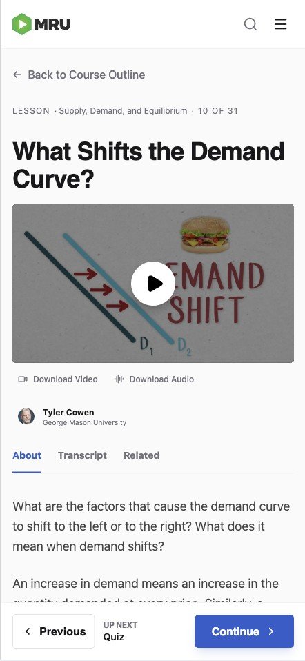
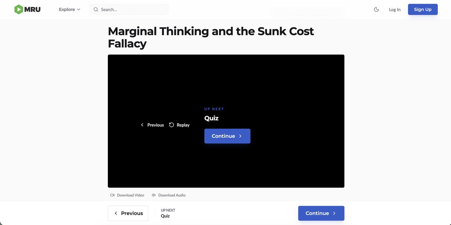
3 · The lesson
Cut what competes with learning: the in-lesson course outline is gone — navigation lives on the course page — and every step ends by pointing to the next.
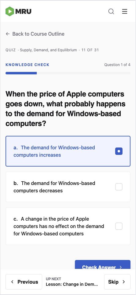
4 · The quiz
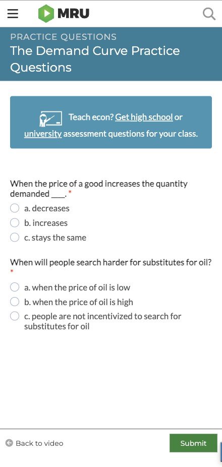
Every question on one page became one question at a time — and the bottom bar got smarter: "Back to video / Submit" became Previous, Skip, and what's up next by name.
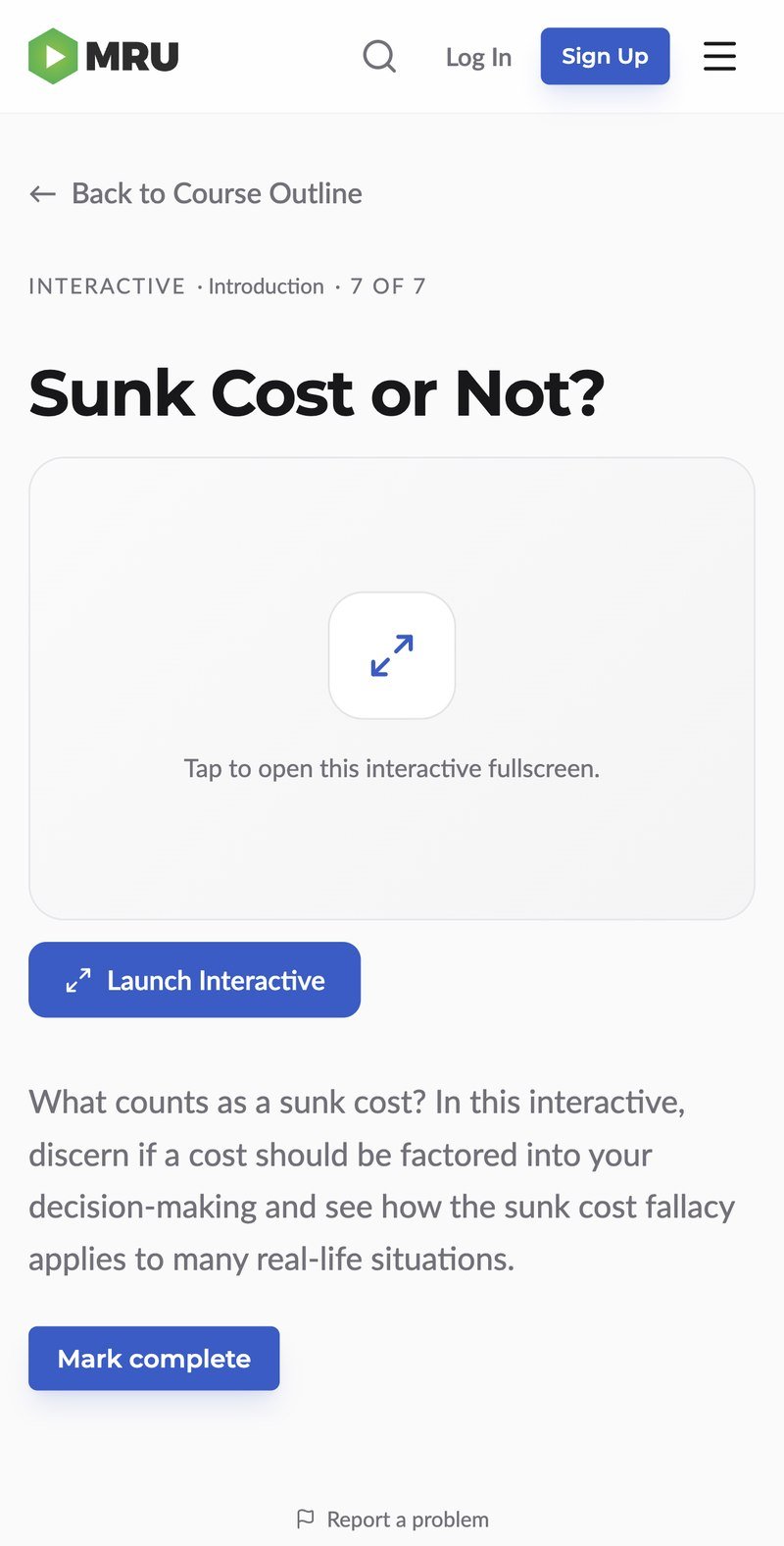
5 · The interactive
Still third-party embeds until they're rebuilt natively — so the design work focused on getting in and out of fullscreen cleanly, in either orientation.

02 The moments between
Progress gets acknowledged — streaks, unit and course completions, confetti on a passed quiz.
Consistency
Daily goal met. Streak extended.
You're on a 3-day streak.
Unit Complete
Unit complete
Introduction is complete.
Course Complete
You completed this course.
Principles of Economics: Microeconomics
03 How it was built
There was no mockup phase. I had Codex write a technical-requirements prompt so that what Google AI Studio built would be compatible with the repo; the shell came back in as the design direction, and most of the finessing happened from there, in Codex/Claude Code. A token system, written usage rules, and a CI check that blocks hardcoded styles keep it consistent. There's no before/after metric on this page: the problems were obvious, and we never had learner-level measurement set up on the old site. Now we do — every step of the flow emits events, so we'll know whether these changes actually work. More in the engineering write-up.